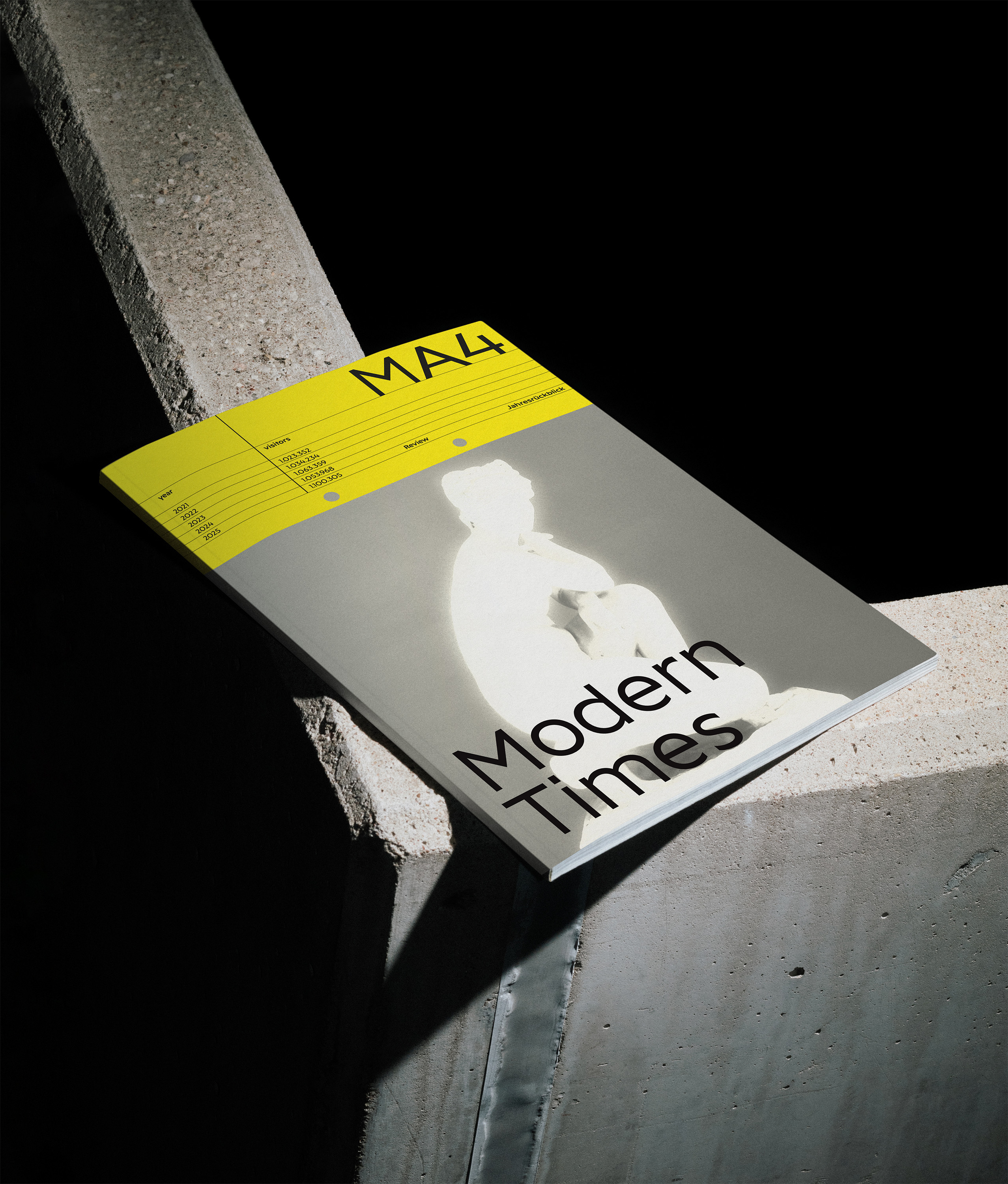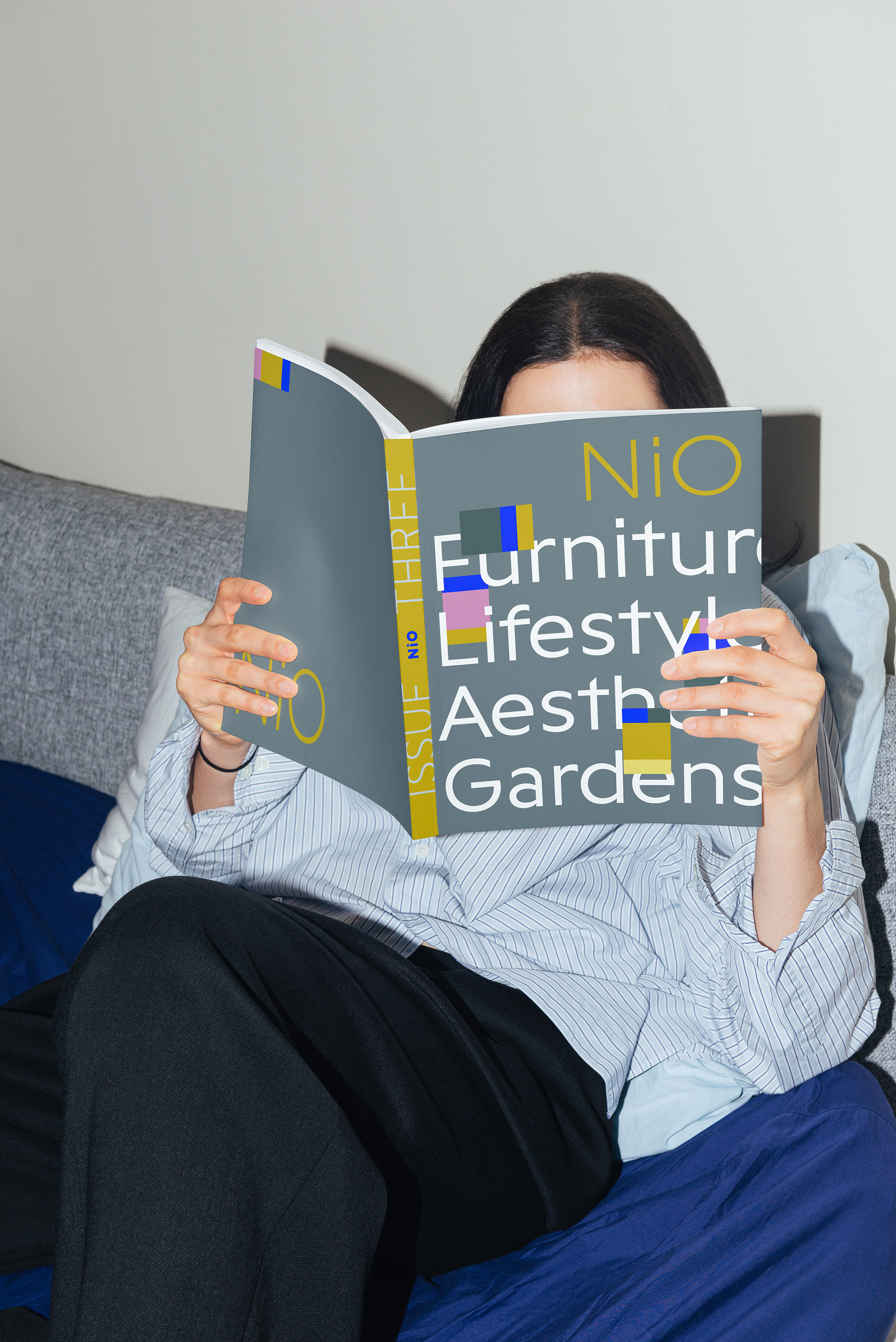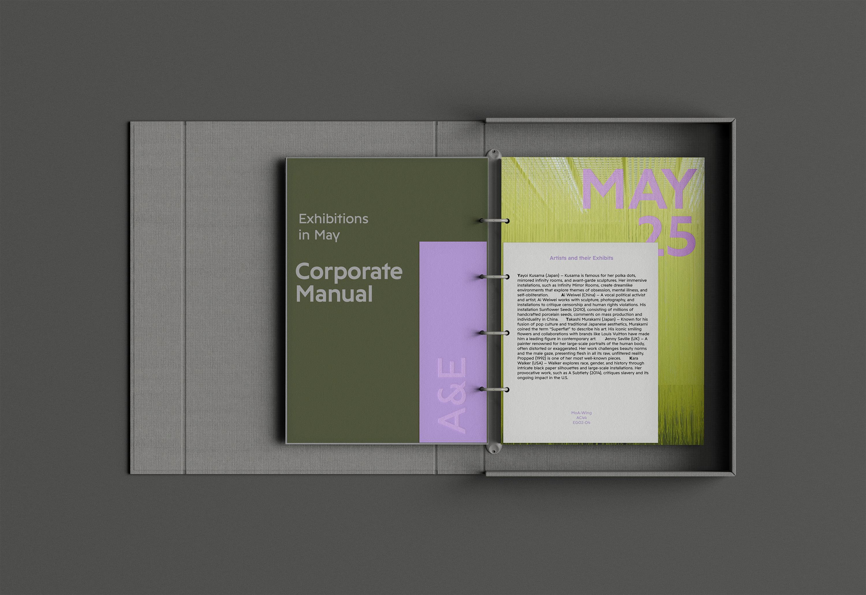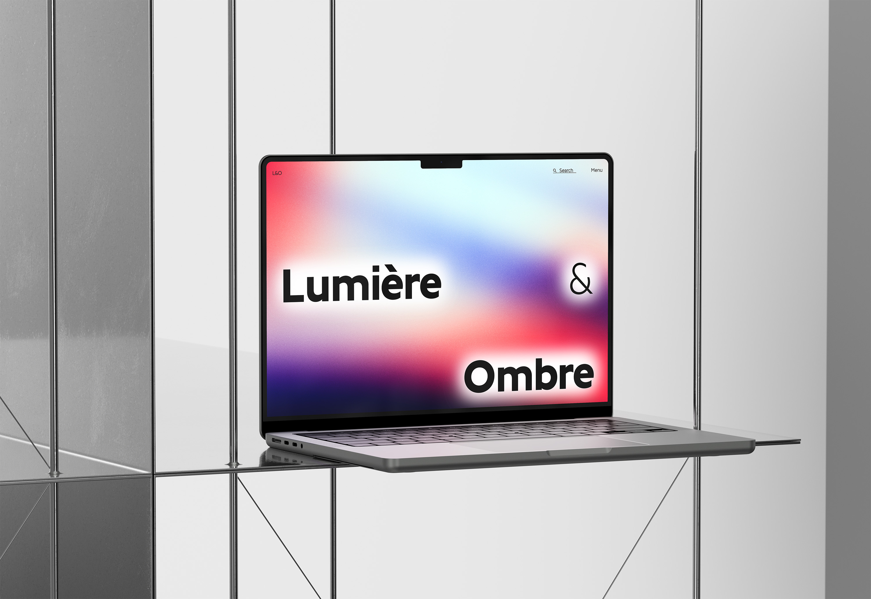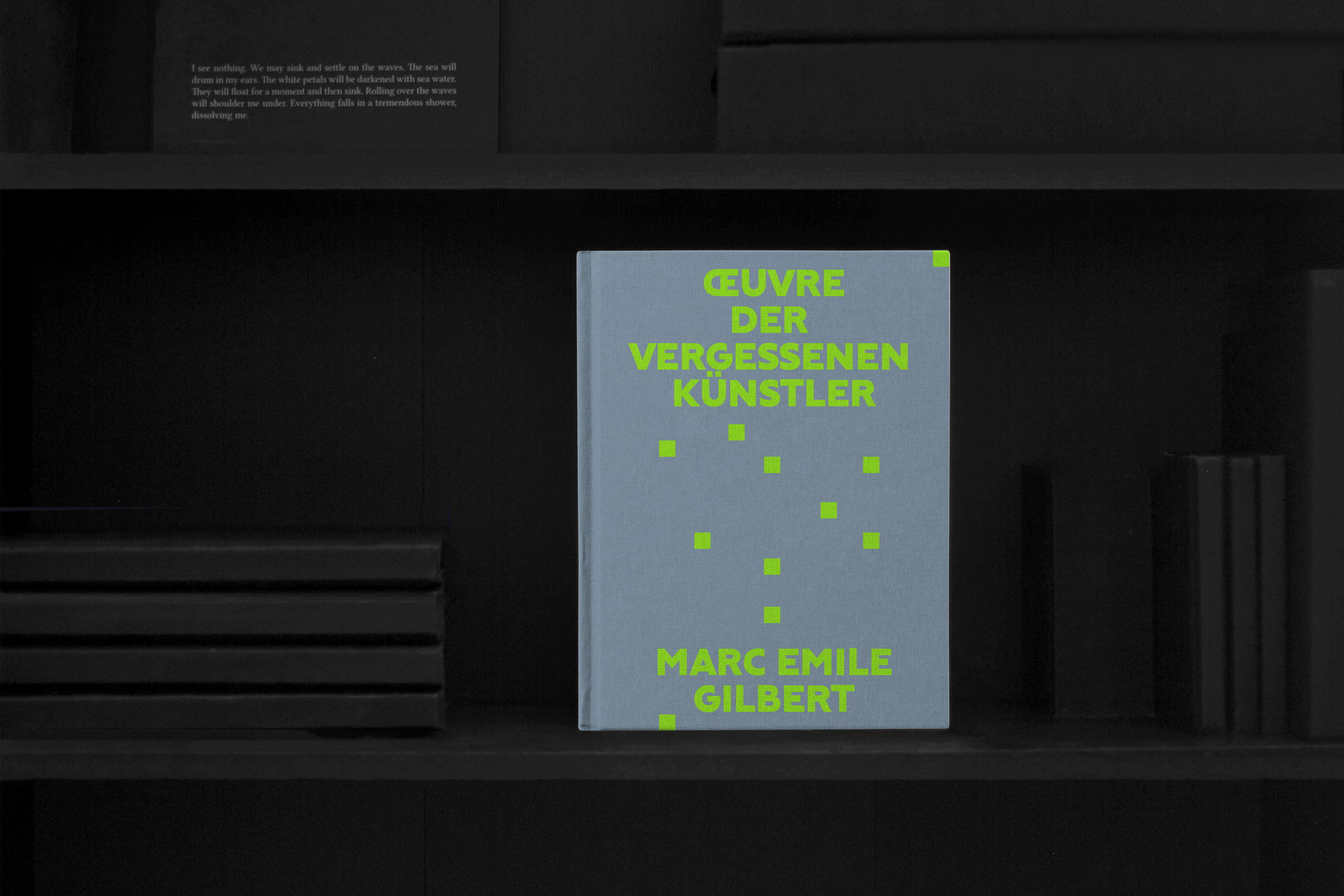

Golt is a contemporary sans serif typeface designed for clarity, character, and versatility. Rooted in the visual culture of Berlin’s metro and street signage, Golt reflects the functional clarity and typographic discipline that define the German design tradition.
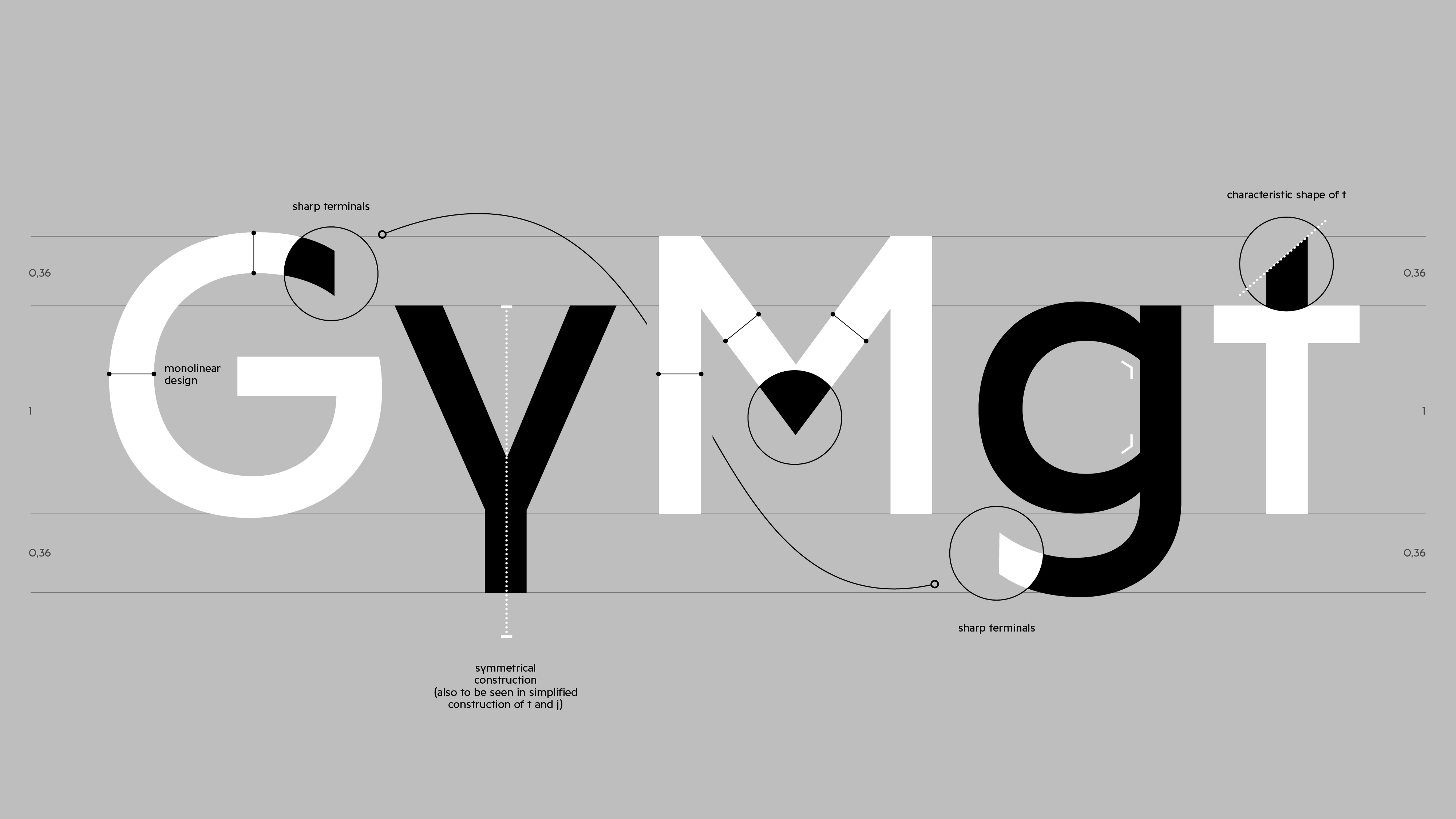
The typeface combines a wide, rounded construction with sharply defined vertical strokes, resulting in a balanced texture that performs well across both digital and print environments. Distinctive features—such as the open G, angled t, and characteristic y—add subtle identity without compromising usability. Several letterforms, including the contextual alternates for the German “Eszett” (ß), pay direct homage to Berlin’s street sign typefaces from the early 20th century as well as Andreas Frohloff’s redesign in the 1990s.
Golt is ideal for brands that value typographic integrity and require a sans serif that feels contemporary yet considered. Whether used in headlines, wayfinding, or body text, Golt delivers a confident and cohesive presence—perfect for brands seeking a modern typeface with substance.
Daniel Perraudin
Alexander Roth
Noe Blanco
Marie Dokter
2025
Golt—a Berlin typeface in its own right
Synthesizing diverse typographic influences drawn from Berlin’s urban landscape, Golt fuses characteristics from various typographic styles into a coherent and original design system.
Berlin’s historic street signage was originally designed by Herbert Thannhäuser around 1942. Its shapes are inspired by a typeface that was widely used in the early 20th century: Erbar Grotesk, released by Ludwig & Mayer in 1926.
Notably, already the first sketches of Thannhäuser’s street signage typeface features two characteristic ligatures commonly found in Berlin’s street signage: the German Eszett (ß) and the tz ligature.
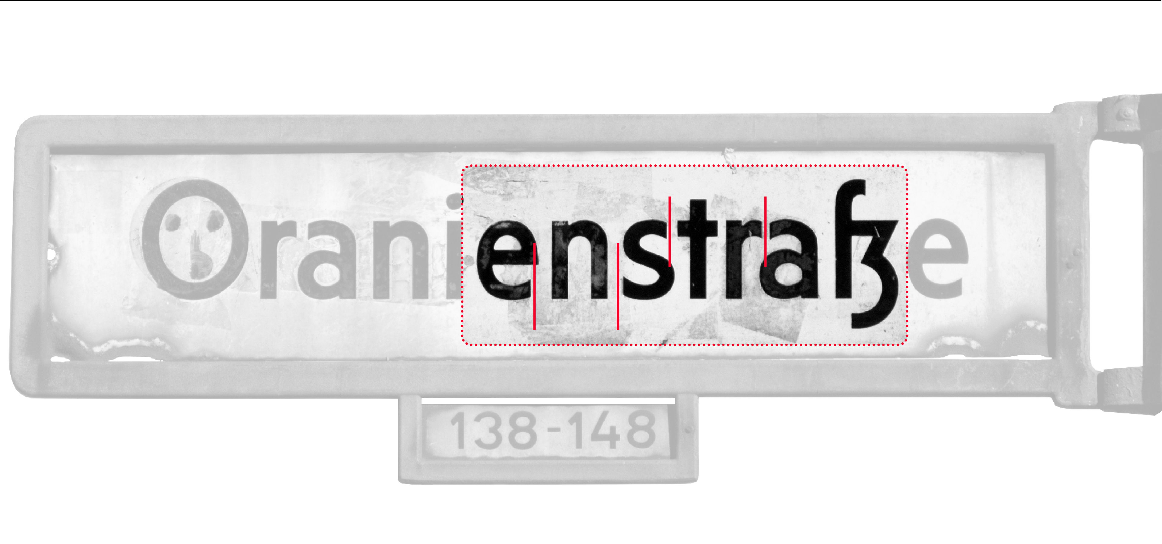
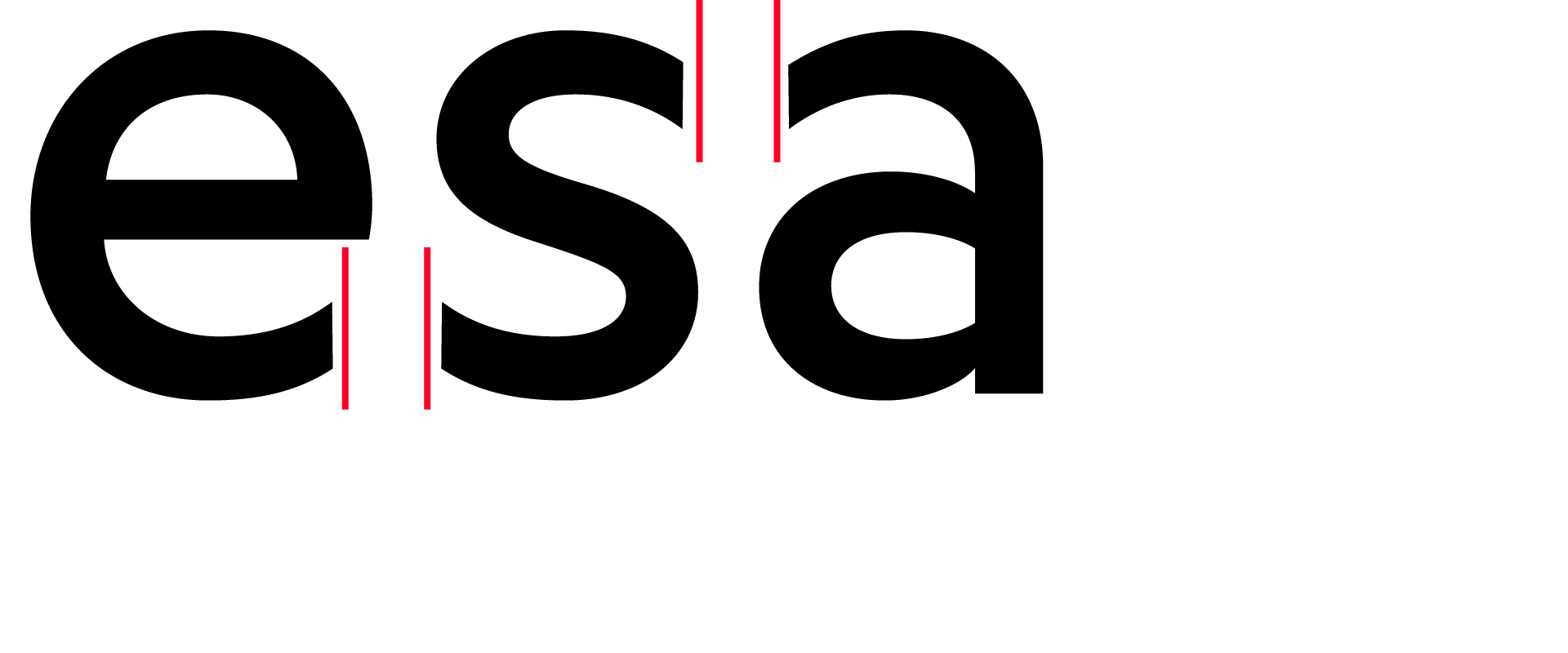
Golt draws on a range of influences from Berlin’s typographic landscape: straight stroke endings as well as other historic details of Berlins street signage on the one hand, and relatively wide proportions found in historic metro signage (particularly along the U8 line) on the other hand.
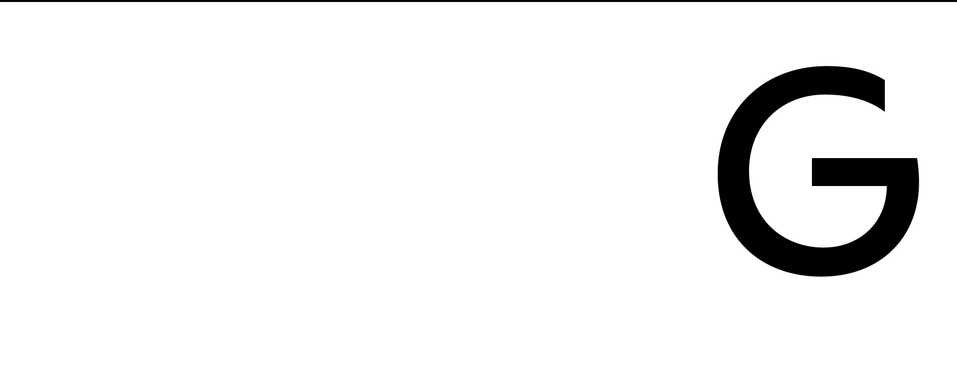
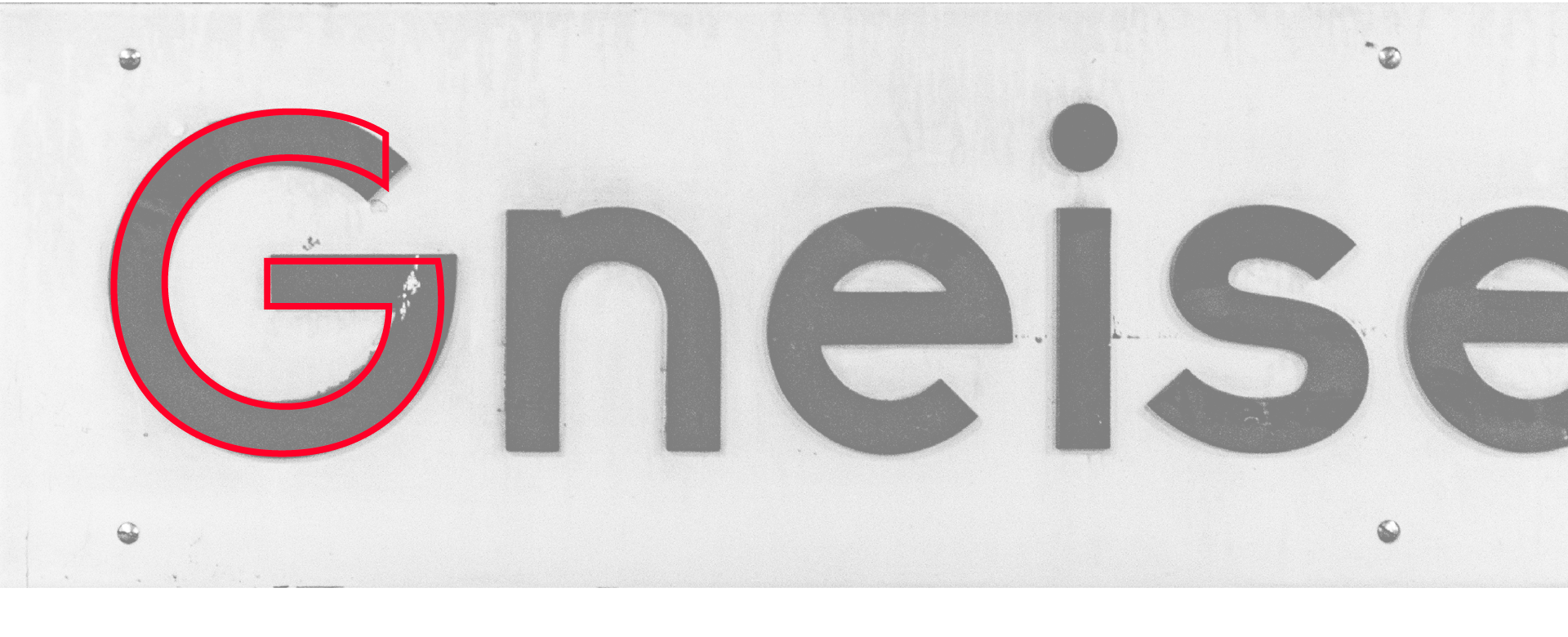
The historic lettering at the
Gneisenaustraße metro station served as a reference for the design of Golt’s uppercase G. While Golt features vertical stroke terminals and a more uniform overall appearance, the proportions of the G remain closely aligned with its historical model.
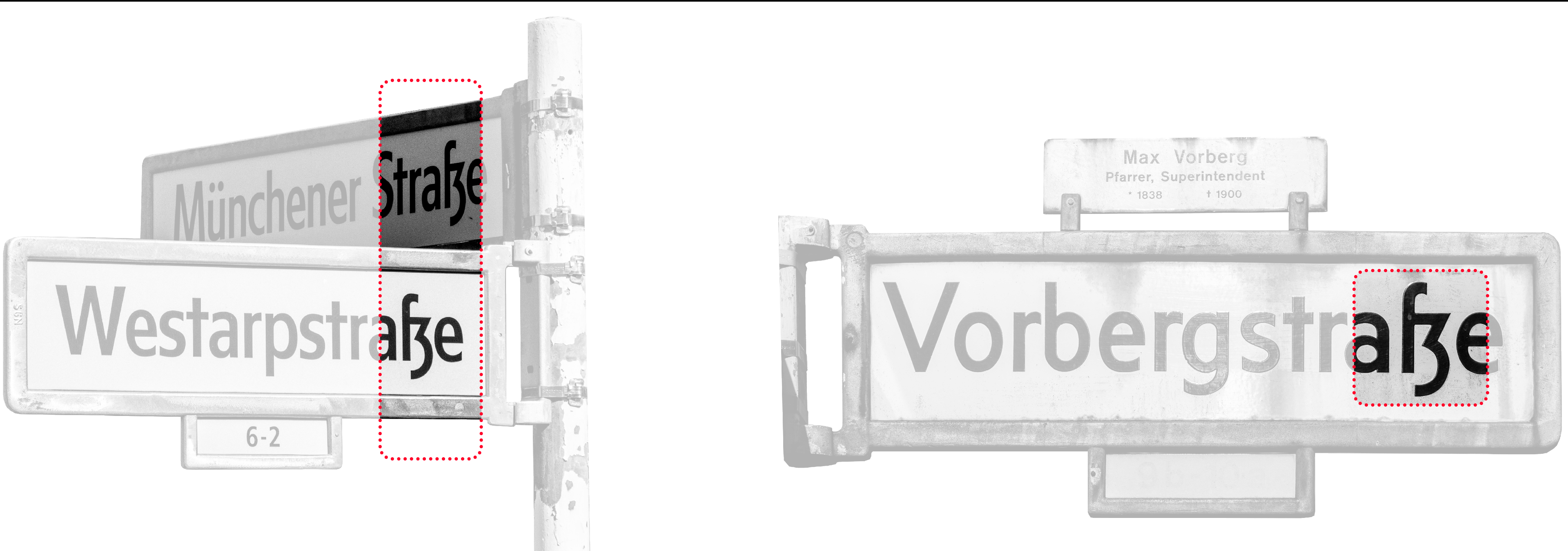
Golt keeps the historic construction of the German Eszett (ß) as a stylistic alternate—in its own proportions, of course. This detail has also been preserved in the 1990s redesign by Andreas Frohloff.
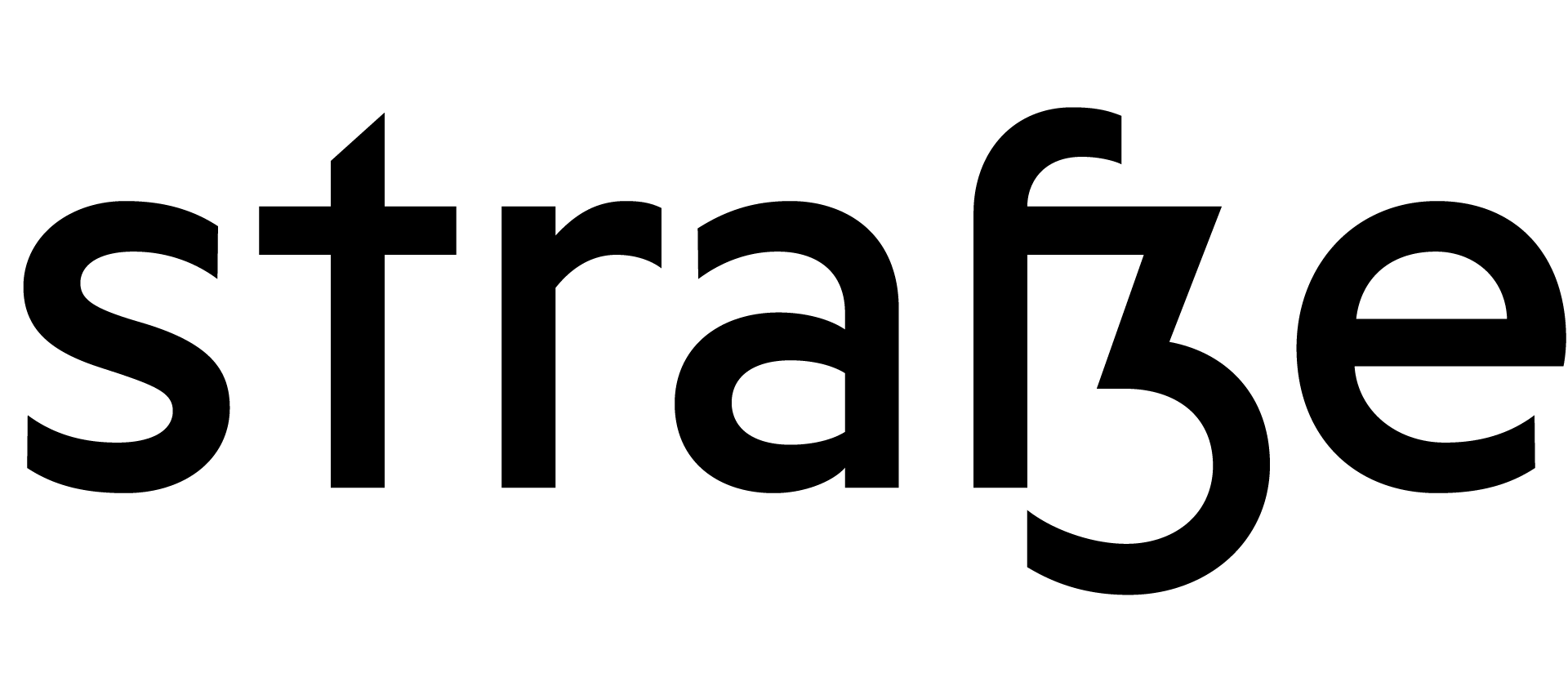

Apart from rather wide proportions, Golt also shares other details with the typeface originally used along the U8 line: sharp corners in M or z, angled top stroke in t, or bevelled joints where round and straight shapes meet.
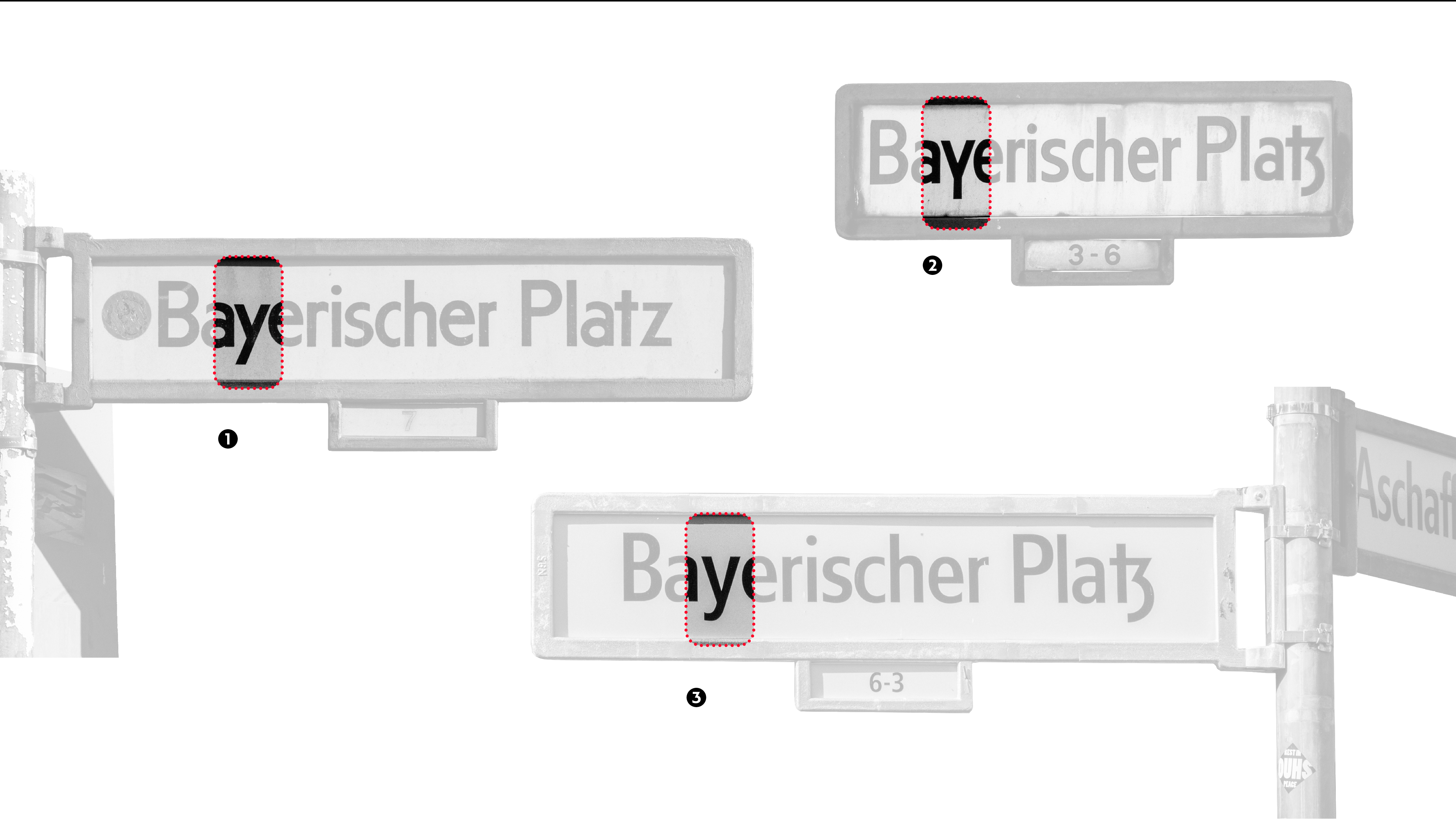
In addition to the conventional, diagonally descending y①, one of the most characteristic features of the historical typeface used in old Berlin street signs is its lowercase y with a straight descender. ② This alternative construction was incorporated into the development of Golt.
Andreas Frohloff’s 1990s revision displays noticeably more conventional forms like the Frutiger-like a—and a lowercase y with diagonal descenders.③
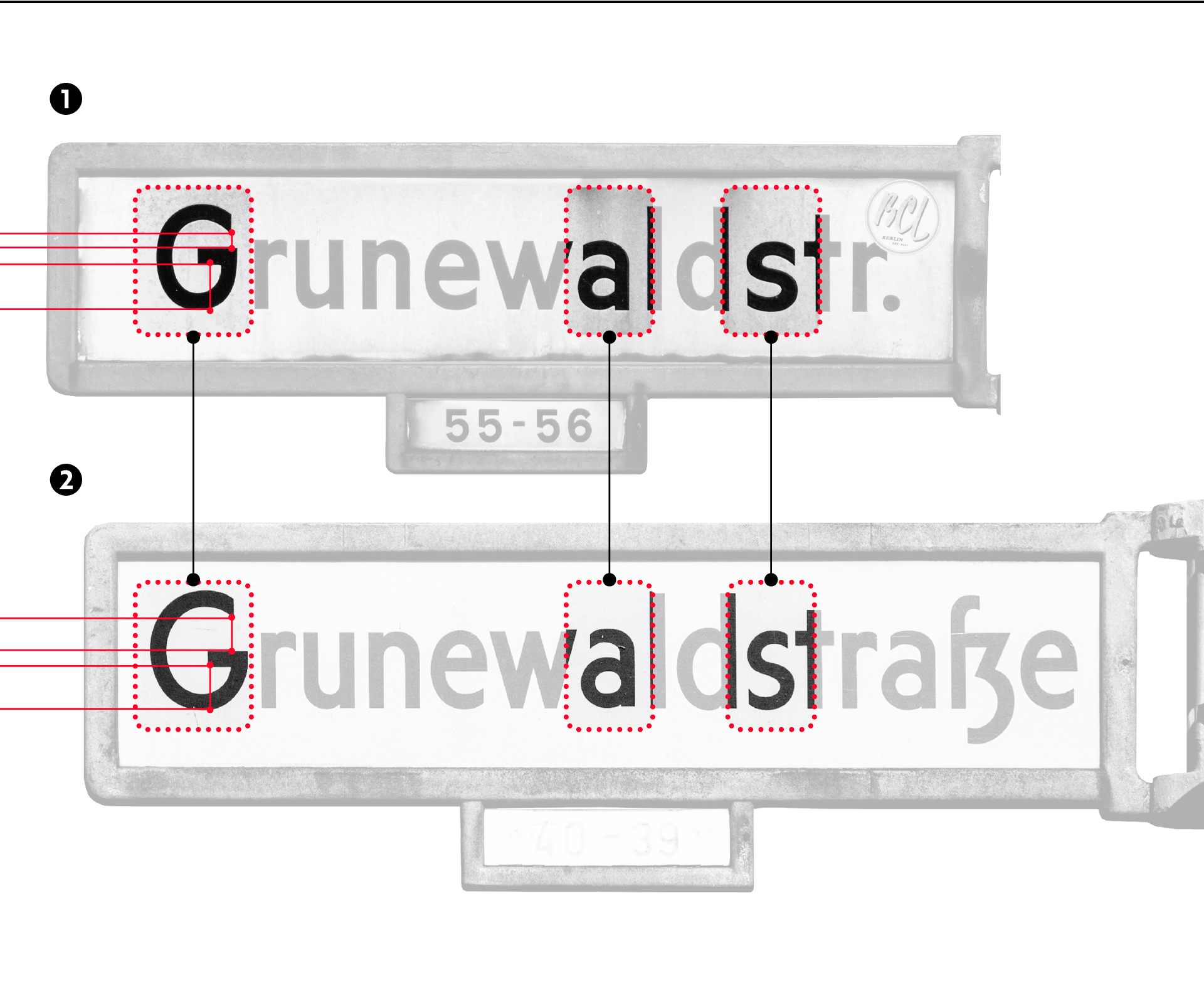
Although based on a popular design (Erbar Grotesk) the historic design of Berlin’s street signs reveals a lot of interesting details with many glyph-level deviations. This is most notably seen in the use of two totally different proportions of the uppercase G—especially striking when signs with similar names are mounted pretty close to each other.
The lowercase a sometimes features an oval counterpunch①, sometimes the counterpunch features edges where the bowl meets the stem.② Differences can also be seen quite obviously in the proportions of the lower case s: ① displays a rather wide construction that is a lot more closed on the top, whereas ② features a narrower and more open construction.
Afrikaans
Albanian
Asu
Basque
Bemba
Bena
Breton
Catalan
Chiga
Colognian
Cornish
Croatian
Czech
Danish
Dutch
Embu
English
Esperanto
Estonian
Faroese
Filipino
Finnish
French
Friulian
Galician
Ganda
German
Gusii
Hungarian
Icelandic
Inari Sami
Indonesian
Irish
Italian
Jola-Fonyi
Kabuverdianu
Kalaallisut
Kalenjin
Kamba
Kikuyu
Kinyarwanda
Latvian
Lithuanian
Lower Sorbian
Luo
Luxembourgish
Luyia
Machame
Makhuwa-Meetto
Makonde
Malagasy
Maltese
Manx
Meru
Morisyen
Northern Sami
North Ndebele
Norwegian Bokmål
Norwegian Nynorsk
Nyankole
Oromo
Polish
Portuguese
Quechua
Romanian
Romansh
Rombo
Rundi
Rwa
Samburu
Sango
Sangu
Scottish Gaelic
Sena
Serbian
Shambala
Shona
Slovak
Slovenian
Soga
Somali
Spanish
Swahili
Swedish
Swiss German
Taita
Teso
Turkish
Upper Sorbian
Uzbek (Latin)
Volapük
Vunjo
Walser
Welsh
Western Frisian
Zulu
Wanna try before you buy? Wanna know more about our special licensing model? It won’t get any easier (and fairer) Thinking about a custom font? Sure, let’s have a chat Just want to say hi? Anytime, drop us a line
